Card Group Examples
The following example is a card group that is pulling in a feed from the most recent news articles at CAHNRS News.

Three CAHNRS faculty named to the Washington State Academy of Sciences
Three scientists in the College of Agricultural, Human, and Natural Resource Sciences are newly named members of the Washington State Academy of Sciences for 2026.

WSU biochemist elected to Washington State Academy of Sciences
Mark Lange, director of WSU’s Institute of Biological Chemistry, will serves as a source of scientific and technical information for WSAS.

New student regent brings passion for empowering young people
Nicole Anthony, a senior pursuing a bachelor’s degree in human development, is serving as the student regent on the WSU Board of Regents for the 2026–27 academic year.

CAHNRS Cougs, Cosmic Crisp® apples bring community together for USA 250th party
Sarah and Steve Vining, a married couple with proud links to Washington State University’s College of Agricultural, Human, and Natural Resource Sciences, invited their lakeside community to a floating celebration that connected the nation’s 250th birthday, Cougar pride, and Washington’s own Cosmic Crisp® apple.
Adding a Card Group Block
Method 1 – Use a forward slash (/) and then type out “card group”. The card block should show up.
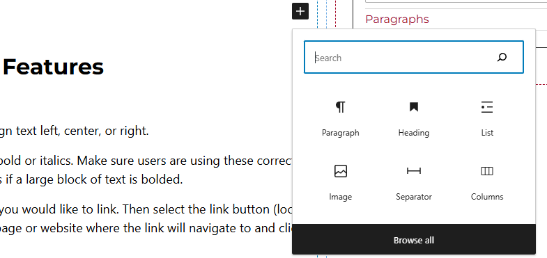
Method 2 – After selecting the editor, the user should see a + icon. Selecting this should show a list of the most common blocks used. If the card group block is not there, use the search feature to find it.
Card Group Block Features
Side Panels
After selecting the card block, the user will see the following options on the right hand panels:
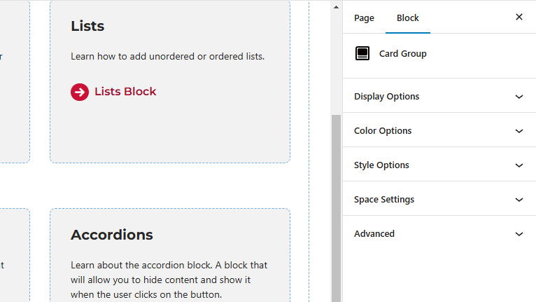
- Display Options – Select the amount of columns per row. Users will also be able to toggle off or on the “Feed Content” option here.
- Feed Content – When this is toggled on, users will have the capability of showing or hiding the image, title, or caption. Here, users will also be able to limit the caption length and add a link button along with setting the image ration and heading level.
- Style Options – Change the layout of the card.
- Color Options – Add a background color or border color to the card.
- Space Settings – Users can add margin to the block. This is usually done to add more spacing around block so they are not too close to other elements. The toggle feature for collapsing card spacing is also in this panel.
- Advanced – Allows users to schedule the block, position the block, create an anchor link to the card group, and hide the block on a specific breakpoint.
- Block Scheduling (if enabled) – Allows block to be scheduled. This causes the block to be published or unpublished depending on the date selected.