Note Examples
Note in a generic container with a white background
Generic containers do not have any margins or padding. Good to use these inside of columns or other blocks where you don’t want additional padding.
Note in a one column with dark background
Columns have padding applied, which creates additional space around the content inside. Use this when you want to achieve this look.
Note with an icon applied to the title
This note also has a different color border to it.
Adding a Note Block
Method 1 – Use a forward slash (/) and then type out “note”. The note block should show up.
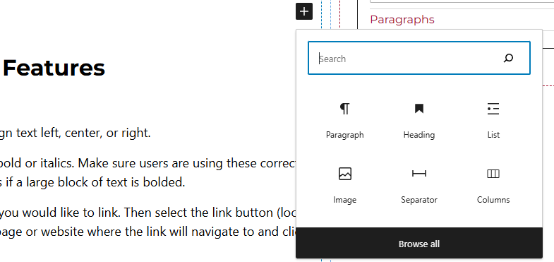
Method 2 – After selecting the editor, the user should see a + icon. Selecting this should show a list of the most common blocks used. If the note block is not there, use the search feature to find it.
Note Block Features
Side Panels
After selecting the stat block, the user will see the following options on the right hand panels:
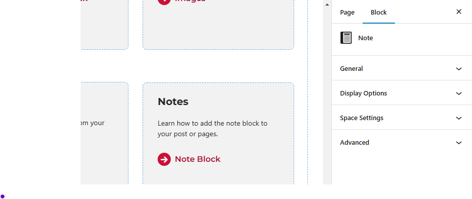
- General – In this panel users will be able to select the icon, enter the note title, and select the title tag.
- Display Options – Toggle on/off the title of the card, select the font size, or change the border color.
- Space Settings – Users can add margin to the block. This is usually done to add more spacing around block so they are not too close to other elements.
- Advanced – Allows users to schedule the block, position the block, and hide the block on a specific breakpoint.
- Block Scheduling (if enabled) – Allows block to be scheduled. This causes the block to be published or unpublished depending on the date selected.