Adding a Column Block
Method 1 – Use a forward slash (/) and then type out “columns”. The column block should show up.
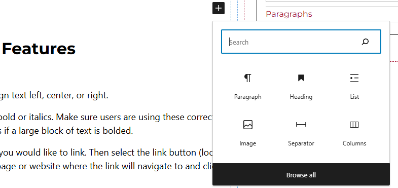
Method 2 – After selecting the editor, the user should see a + icon. Selecting this should show a list of the most common blocks used. If the columns block is not there, use the search feature to find it.
Column Block Features
When the column block is added to the page, the user will have the capability of selecting the amount of columns to the editor. The choices are:
- Single
- Halves
- Thirds
- Quarters
- Sidebar Right
- Sidebar Left
- Sidebars
Side Panels
Entire Block Selected
- Column Options – Allows users to add a background color to the entire row of columns.
Individual Block Selected
After selecting the individual column block, the user will see the following options on the right hand panels:
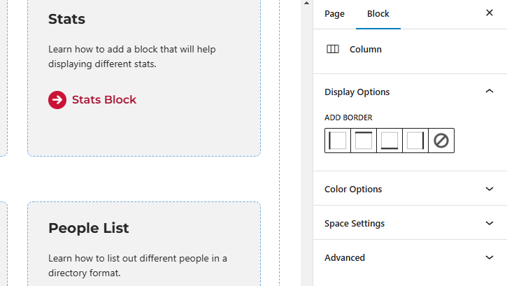
- Display Options – Users can add a border to the individual column (top, right, bottom, or left).
- Color Options – Change the color of the background for the individual column and/or change the color of the border.
- Space Settings – Users can add margin and/or padding to the columns blocks. This is usually done to add more spacing around text so they are not too close to other elements.
- Advanced – Allows users to add anchor tags to the text, schedule the block, position the block, and hide the block on a specific breakpoint. Users can also set a custom width for the column here.
- Block Scheduling (if enabled) – Allows block to be scheduled. This causes the block to be published or unpublished depending on the date selected.