Card Group Examples
The following example is a card group that is pulling in a feed from the most recent news articles at CAHNRS News.

New guides help identify wheat virus, control pests, and support Spanish-speaking bee enthusiasts
The latest guides from WSU Extension include resources to help farmers identify a new wheat virus, along with Spanish-language information for beekeepers and enthusiasts, as well as a revised manual on household pests.

WSU grizzly goes to the dentist
It turns out even bears need their teeth worked on from time to time.
When Adak, a resident of WSU’s Bear Research, Education, and Conservation Center, recently damaged his canine tooth, the university’s vets stepped in to help.

New facility builds on long WSU, USDA partnership to boost agriculture
WSU and USDA-ARS opened the new USDA-ARS Plant Bioscience Research Building to boost research and help growers.

Washington State University experts to share solutions for tree fruit at FIRA USA
Experts in CAHNRS will present innovations shaping the future of tree fruit agriculture at FIRA USA 2026. The college sponsors the event and is helping organize Innovation Day and Campus Day.
Adding a Card Group Block
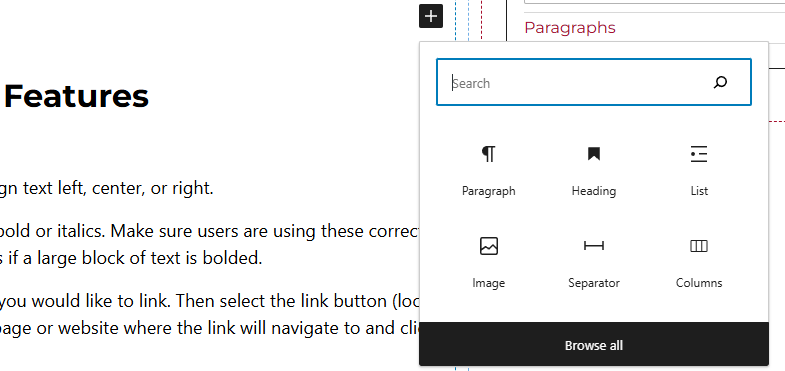
Method 1 – Use a forward slash (/) and then type out “card group”. The card block should show up.
Method 2 – After selecting the editor, the user should see a + icon. Selecting this should show a list of the most common blocks used. If the card group block is not there, use the search feature to find it.
Card Group Block Features
Side Panels
After selecting the card block, the user will see the following options on the right hand panels:
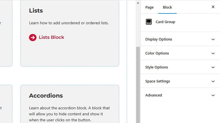
- Display Options – Select the amount of columns per row. Users will also be able to toggle off or on the “Feed Content” option here.
- Feed Content – When this is toggled on, users will have the capability of showing or hiding the image, title, or caption. Here, users will also be able to limit the caption length and add a link button along with setting the image ration and heading level.
- Style Options – Change the layout of the card.
- Color Options – Add a background color or border color to the card.
- Space Settings – Users can add margin to the block. This is usually done to add more spacing around block so they are not too close to other elements. The toggle feature for collapsing card spacing is also in this panel.
- Advanced – Allows users to schedule the block, position the block, create an anchor link to the card group, and hide the block on a specific breakpoint.
- Block Scheduling (if enabled) – Allows block to be scheduled. This causes the block to be published or unpublished depending on the date selected.