Card Examples
These are some of the different options for cards:

This is the default card view.
This is the card caption

This is a card with a dark background.
This is the card caption

This is a card with a gray background
This is the card caption
Horizontal Cards
All Card examples below have a gray background applied.
This is a horizontal 25% Card
The card caption goes here.
This is a horizontal 33% Card
The card caption goes here.
This is a horizontal 50% Card
The card caption goes here.
Horizontal Reverse Layout Cards
All Card examples below have a gray background applied.
This is a horizontal 25% Card
The card caption goes here.
This is a horizontal 33% Card
The card caption goes here.
This is a horizontal 50% Card
The card caption goes here.
Card with Custom Content
This is will be the title of the card
This is going to be the caption
Turning on the “Custom Content” feature will allow users to add other blocks inside the card like this
Cards with Borders
All Card examples below have a gray background applied.
This is a card with a crimson border
This card has a crimson-light border
This card has a midnight border
Adding a Card Block
Method 1 – Use a forward slash (/) and then type out “card”. The card block should show up.
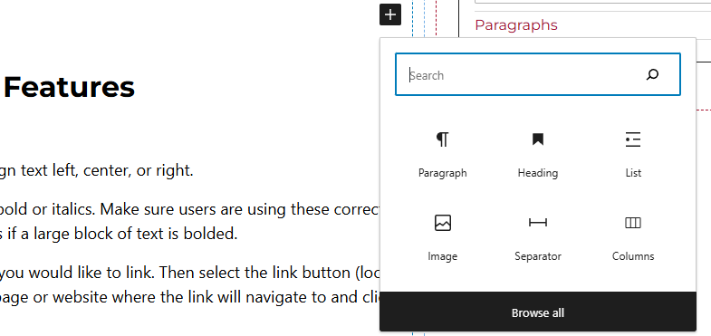
Method 2 – After selecting the editor, the user should see a + icon. Selecting this should show a list of the most common blocks used. If the card block is not there, use the search feature to find it.
Card Block Features
Side Panels
After selecting the card block, the user will see the following options on the right hand panels:
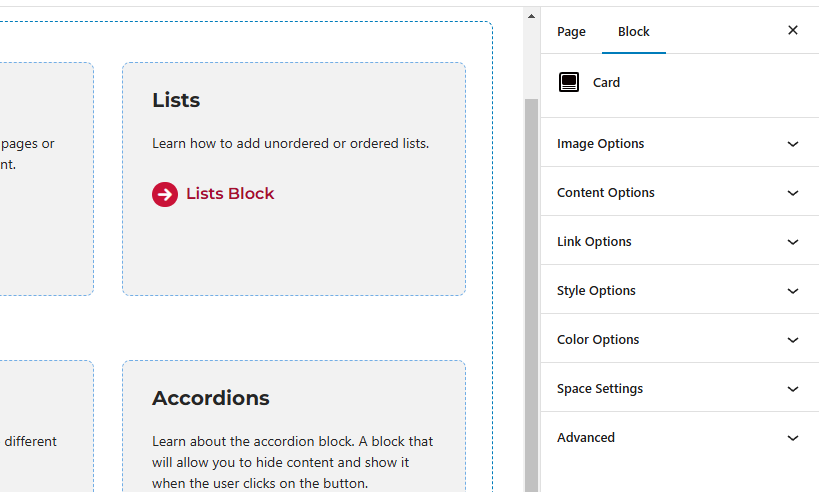
- Image Options – Add or remove the image from the card.
- Content Options – Allows users to toggle off or on the image, title, caption or custom content. If the user would like to add a button to the card block, “Custom Content” needs to be toggled on. Other options in this panel include heading level and heading font size.
- Link Options – Add a URL of where the card will navigate the user to. There is a toggle option in this panel as well to link the entire card.
- Style Options – Change the layout of the card.
- Color Options – Add a background color or border color to the card.
- Space Settings – Users can add margin and/or padding to the block. This is usually done to add more spacing around block so they are not too close to other elements.