Card Group Examples
The following example is a card group that is pulling in a feed from the most recent news articles at CAHNRS News.
Extension Publication: Protect Washington tree fruit from pests, weeds with revised guide
New from WSU Extension, a revised 2026 guide to safely protecting Washington tree fruit crops from pests, weeds, and pathogens.

Long-term study confirms pollen-replacing feed strengthens honey bee colonies
New study shows a man-made food source provided honey bees a nutritious diet at a commercial scale.

New study sheds light on protein landscape crucial for plant life
Scientists share new insights on the microscopic landscape of proteins crucial to photosynthesis, the basis of Earth’s food and energy chain.

WSU scientists capture a bear’s eye view of life in the Arctic
WSU researchers recently attached video cameras to collars on several Arctic grizzly bears to learn more about their lives.
Adding a Card Group Block
Method 1 – Use a forward slash (/) and then type out “card group”. The card block should show up.
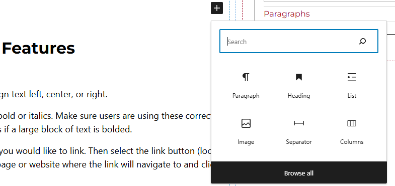
Method 2 – After selecting the editor, the user should see a + icon. Selecting this should show a list of the most common blocks used. If the card group block is not there, use the search feature to find it.
Card Group Block Features
Side Panels
After selecting the card block, the user will see the following options on the right hand panels:
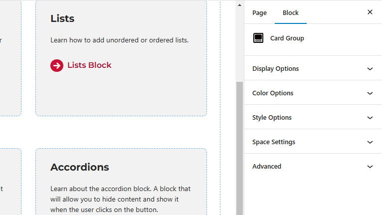
- Display Options – Select the amount of columns per row. Users will also be able to toggle off or on the “Feed Content” option here.
- Feed Content – When this is toggled on, users will have the capability of showing or hiding the image, title, or caption. Here, users will also be able to limit the caption length and add a link button along with setting the image ration and heading level.
- Style Options – Change the layout of the card.
- Color Options – Add a background color or border color to the card.
- Space Settings – Users can add margin to the block. This is usually done to add more spacing around block so they are not too close to other elements. The toggle feature for collapsing card spacing is also in this panel.
- Advanced – Allows users to schedule the block, position the block, create an anchor link to the card group, and hide the block on a specific breakpoint.
- Block Scheduling (if enabled) – Allows block to be scheduled. This causes the block to be published or unpublished depending on the date selected.